
Thursday 20 December 2007
Sunday 9 December 2007
Mr.T

Just a bit of fun... Still working on the book rewrite but this idea has been hanging around for a while and I thought it was time to get him out there.
Sunday 18 November 2007
Story rewrite. If a thing's worth doing...

Progress report. I sent off a draft of the story to my US agent a couple of weeks ago. I heard back from them on friday last and they were good enough to provide a full and frank feedback on the work so far. I have to admit I was knocked for six when I first read their comments but after sitting back and mulling things over I can see where they are coming from. So it's back to the nuts and bolts of the story to sort things out with a rewrite. I never intended for the story and artwork to be set in stone at this early stage, and I want to give this my best shot before I try to hawk my wares! If nothing else it's a great learning experience...and we all have to start somewhere. Expect news as it happens. For now here's the latest (unfinished) storyboard before I put on the brakes.
Monday 12 November 2007
storyboard- pages 8-9

Here's Grandpa hard at work on his night shift, which of course leaves hiim quite sleepy during the daytime!
I was talking with a friend over the weekend (many thanks for listening Al :) and realised that I need to change an aspect of the story on spread 18-19. There are one too many lightbulbs getting broken, which just spoils the flow of the story, so I've rewritten and will have to rework the sketch storyboard. There is another big plus in changing 18-19 as I get to have my storm sequence as a double page spread on 16-17. This was something I really wanted to do from very early on but couldn't get it to work with my earlier page plan. Now I can have this as a double spread it gives me the chance to really show the scale and power of the storm and the characters predicament.
Friday 9 November 2007
Flattered and puzzled...?!

Came upon a very surprising and confusing post about this blog yesterday. "Children's Books Illustration" posted on youtube on Oct 6th by "alanjasonb" has a slideshow of images from my website and blog which then cuts into the great Eric Carle's artwork...and all this to a soundtrack of Bach's cello suite (spookily, a piece of music I love...). Just to be mentioned alongside Eric Carle is a great compliment and I'm very flattered indeed. Perhaps if alanjasonb is still reading this blog he/she/they might like to post a comment describing their thought process for this nice gesture. The internet truely is a strange and wonderful place sometimes. Many thanks alanjasonb.
Wednesday 7 November 2007
storyboard- pages 6-7 text design

As always my good friend Phil's advice is spot on, cheers phoole! I wasn't going to dwell on the design of the text too much at this stage (just make sure it would fit at the correct point size) but I think I do need to iron things out as I proceed page to page. I'm also being ruthless again, pairing down the story even more as I work on each new page spread. It may still be too wordy on some pages but I can work on that later if necessary. Its still surprising how you see things afresh at each new stage of the book. Some words/phrases which have withstood countless drafts of the story just seem superfluous now I see them against the images. As far as page 7 goes, I'm going to leave the 'sounds' in for now and see how they work when you view the book as a whole. I have always wanted to incorporate some 'audio' but I'm cautious how far I should push it. I think it's important to strike a balance between playful text design and clarity in the page layouts. There's nothing worse than having to go hunting for the next line amongst the image, but I do love the playfulness you can get out of typography.
Sunday 4 November 2007
storyboard- pages 6-7

As Magnus gets ready for bed his Grandpa climbs the stairs to the top of the lighthouse and switches on the light...self explanatory really. I want to capture a little of the classic James Whale Frankenstein in Grandpa switching on the light so imagine blue sparks and bolts of electricity creating an eerie glow until the bulb is fully lit.
Smurf houses on my lawn.

Smurf property developers have moved onto the lawn in front of my house. I haven't seen any little, blue prospective buyers as yet. Maybe they have a look round while I'm not there...? Interesting to see the 'building process' nevertheless.
Saturday 3 November 2007
storyboard- pages 4-5

The slow zoom in to the island and the lighthouse continues. It's getting darker as the sun sinks below the horrizon. Pin prick stars are just visable in the sky. We zoom in further until the lighthouse door and the two figures fill the frame. The text introduces Magnus and his Grandpa.
If you compare these figures to my early posts of the character's design you can see that I've played around with the look of Magnus and Grandpa a bit more. Drawing these two so many times for the thumbnail storyboard I've eventually settled into something which is more comfortable for me to draw while also, hopefully, giving Magnus a younger look and making him more visually likable. I've also 'had the builders in' to the lighthouse and added the porch structure. I wanted something which would iron out some composition/lighhouse door design issues I was experiencing with page 5 while also giving the lighhouse more of a homely feel and also providing a focal point for the zoom in.
storyboard- pages 2-3

First of the cleaned up, 50% actual size storyboards. It's sunset with candyfloss clouds in a salmon pink/orange/violet sky. Gulls wheel in the sky. A purple/black night is falling. On the small rocky island light from the lighthouse porch doorway is pooled around two tiny figures. This spread will also contain the legal text and title page.
What I did this October... book thumbnail storyboard.

I see it's been a whole month since I last posted...doh! As always I've been beavering away at my work while letting the blog slip by the wayside. By way of recompense here's the rough storyboard for the book. Some pages came togther much quicker than others but I'm pretty happy with where I'm at as far as page layouts and story pacing goes. Things will no doubt change slightly as I work the thumbnails up into the clean storyboard, which will also provide my underdrawings for each page, but by and large the book has taken on it's final shape.
Monday 1 October 2007
Lighthouse development sketches


Here is a small selection of the sketchbook work I've done to get the lighthouse setting straight in my mind. Right now I'm finally putting the characters and environments to good use and rough storyboarding. It's interesting how things develop as you progress through all the stages of the book. Obviously things which have been hazy in my mind (how rooms look, the exact geography of the island...etc) now have to become more defined while other 'fixed' elements are evolving into something slightly different. It's great that a story you've grown sick of reading and rereading can still throw out surprises.
Thursday 27 September 2007
Lighthouse colour study.


On a tiny rocky island in a cold, stormy sea there stood a red and white striped lighthouse... Here is Magnus and Grandpa's home. The artwork is a hybrid of watercolour for the sea base and sky with digital for the lighthouse, island and waves. I want the sea and sky to have a liquid, changable quality to allow for the various weather and sea conditions (a storm is coming...) and also to soften the artwork up a bit when it is viewed as a whole (I have also been experimenting with watercolour in the characters flesh to both soften it and to give that windblown, raw look).
Sunday 23 September 2007
all new Piggy colour study & character scale lineup


Well I wasn't sure about my design for Piggy and after a few days of staring at version one and filling page after page of the old sketch book I have something more appropriate to the character. It wasn't right to have Piggy in profile with one eye visable while Magnus and Grandpa were face on. Also the new design has Piggy constructed from similar basic shapes as the other two characters so they all seem to share the same 'world' (I hope). She also looks more like she enjoys her food (as the story calls for her to wolf down the odd bacon butty or two!). While I was tweaking things I also reduced the height on Magnus' head (even though I want his design to have parallels with the design of his lighthouse home...hence the stripey jumper... his head was just that bit too tall) and modified the eyes on all three (think you were right Kev, ta). The story continues... ...
the finished Penguin Classics Bulgakov covers

It was fantastic to receive a package from Penguin books yesterday containing the finished Bulgakov book covers! As I mentioned on this blog on July 3rd, The Master and Margarita is a reprint from a 2003 silver Penguin Modern classics cover which I won a competition to illustrate (also see my website) while the A Dog's Heart and A Dead Man's Memoir (A Theatrical Novel) were commissioned directly from Penguin last year. My thanks again to the team at Penguin for all their help and encouragement!
While on the subject of Penguin I just bought a copy of "Seven Hundred Penguins" which I recommend you check out at your local bookshop. As the title suggests this weighty tome contains 700 Penguin book covers running from 1935-2000. I wouldn't say that every cover was a winner but taken overall it is an amazing body of work with some real gems. The actual book is also a great piece of design in it's own right thanks to David Pearson (www.davidpearsondesign.com) and if you like what you see I'd also suggest you pick up a copy of "Penguin by Design" by Phil Baines with the book design again by David Pearson.
So there is a reading list for lovers of book design and Russian literature (A Dead Man's Memoir is yet to be published, I believe it will be out on Oct 4th). If you're not sure about Bulgakov I'd say start with A Dog's Heart as the most accessible of the trio (think Frankenstein meets the littlest hobo...) and move on from there.
Sunday 16 September 2007

revised revised Grandpa.

I've had what I thought was Grandpa in my sketchbook for the last week or so but as soon as I went from sketch to colour digital he just wasn't right. I've also been tweaking the story in line with some excellent 'how to' points from reading "Writing with Pictures" by Uri Shulevitz (out has gone the octopus from page15 ho hum, I really wanted to draw him but he was a loose end which I couldn't tie off satisfactorally at the end of the story). Grandpa just wasn't a sympathetic enough character for the story. In many ways I liked having the moustaches in his design (especially for the way in which thay can emphasize expression, I've sketched out raised moustaches for shock/alarm and drooped for sadness/sleep etc...) but they were wrong for the character and kept cluttering up the face, particularly when I wanted to introduce his pipe. Also he wasn't looking old enough and his look suggested to much the admiral and not enough the sea dog. In the story Grandpa is somewhat a figure of fun and as such needed to be less the authority figure (though of course he remains so for Magnus, his grandson). I think this is third time lucky for the Grandpa design.
Saturday 15 September 2007
Grandpa, revised colour study.

There was something not sitting right with me regarding Grandpa's face... too Santa and not enough ex jolly jack tar. This is more along the right lines. (Thanks for the comments Louise, much appreciated!).
Piggy colour study.

I've just finished the first colour version of Piggy...not sure I have her quite yet...maybe she'll look better when I come back to things after lunch...? Magnus comes next.
Wednesday 12 September 2007
FINALLY a new post! "Grandpa colour study."

At long long last a new post. Everyday the blog has languished I've felt guilty not updating. If you've been checking from time to time, many thanks for your patience...and I'm back.
I haven't been away really but am busy working away on a 32 page children's story book idea. I have finished the text (till the next rewrite at least!) and have a basic structure for what will be single page or double page spreads. I have also pretty much sketched out the basic look for the characters and some environments (will try to post some sketch book pages in the next few days). Next comes more planning, this time sketching for the settings and secondary elements / action. After that I'll make a tighter plan for the page layouts then...eventually...the final art and book design. So not too much to do then!
This is the first idea for a children's story book that I've actually seen through this far (many rough sketches and notes for other stories...) and I'm really enjoying the work. I've been studying the children's book sections of my local bookshops, leafing through my collection of children's books and reading some 'how to' books on the subject of children's book illustration and writing. I can heartily recommend "Words and Pictures" by the amazing Quentin Blake, "The art of Eric Carle", "Picture This, how pictures work" by Molly Bang, and so far, "Writing with Pictures" by Uri Shulevitz is very interesting (though some of the colour seperation / preparation for print is outdated).
To cut the waffle, here's the first rough colour study for one of my main characters, just finished tonight. He is the Grandpa of my other main character, a small boy called Magnus. They both live in a lighthouse, on a small rocky island and along the way a Puffin called Piggy makes an appearance. I'll go into more depth later! Hope you like Grandpa.
Friday 17 August 2007
Ta for the post! & I'm not slacking!
My thanks to Dave Coustan and Tom Harris over at "earthling blog" for posting a link to this blog in their list of sketchblogs to look at - "blogs without all the reading". Just to be mentioned in the same list as DRAWN is very flattering indeed. It's a great boost to know that there are some people who tune in from time to time ... if you are one of them, THANK YOU VERY MUCH! I'll try to make it worth the visit! :)
If you are wondering why I've not posted to Illustration friday for the last couple of weeks, I'm not slacking, honest. To cut a long story short I was very lucky enough to be posted on drawn.ca last month which then lead to me being contacted by an children's book illustration agent over in the US who expressed an interest in wanting to represent me in America...woohoo!!! My heartfelt thanks once again to John Martz at drawn.ca! So all my free time is now spent working up pieces which my agent (that sounds really nice to say) can show to publishers. Like many illustrators out there I have lots of ideas for children's picture books, and now is the perfect time to bring them to life. Expect sketches and page layouts in the near future... At the moment I'm writing and rough sketching...watch this space!
If you are wondering why I've not posted to Illustration friday for the last couple of weeks, I'm not slacking, honest. To cut a long story short I was very lucky enough to be posted on drawn.ca last month which then lead to me being contacted by an children's book illustration agent over in the US who expressed an interest in wanting to represent me in America...woohoo!!! My heartfelt thanks once again to John Martz at drawn.ca! So all my free time is now spent working up pieces which my agent (that sounds really nice to say) can show to publishers. Like many illustrators out there I have lots of ideas for children's picture books, and now is the perfect time to bring them to life. Expect sketches and page layouts in the near future... At the moment I'm writing and rough sketching...watch this space!
Sunday 12 August 2007
Elephants for auction


Here are watercolours which I'd promised to do for a charity auction: elephant research I don't know that I'm totally happy with one of the more naturalistic of the watercolours but Its's made a pleasant change to work with real paint again after all my digital work of late. If anyone has seen my earlier posts you might recognize that a couple of the watercolours are based on a digital elephant I did last month. I found it really useful to go back into my original psd document and switch off layers to plan out my painting. I didn't try to recreate the digital with watercolour (that would just get frustrating) but it was great to have something to aim for.
Saturday 11 August 2007
Xmas elephant

This is a design I've been working on for an elephant charity xmas card. I've tried to appeal to as wide an audience as possible with this (unlike some of my other elephants perhaps...), after all we want to sell as many cards as possible. Fingers crossed it's suitable.
Sunday 5 August 2007
G is for Giraffe


Here's the latest in my ongoing animal alphabet. This one took two just to fit her all in!
Sunday 29 July 2007
"Early Bird Beware."
 Could also be called, "Let sleeping Elephants lie".This is a photoshop piece to allow me to plan out colour and composition for a watercolour I'm going to do for a friend's Elephant charity. It's been a fun picture to do, and unlike some, has come from sketch book to finish quite quickly. I decided not to overwork tone on the elephant, just let the texture of the background do the work...(incidently the background is a scan of recycled coffee paper).
Sunday 22 July 2007
Illustration Friday (poem). "Tyger Tyger".

I've always had a hard time appreciating poetry (unless it's Roald Dahl, Spike Milligan or Edward Gorey), but that said I do like William Blake's "The Tyger":
Tyger! Tyger! burning bright
In the forests of the night,
What immortal hand or eye
Could frame thy fearful symmetry?
and so on...
(& I don't think I've gained "an immortal hand" or eye as a result of working on the image...!) :)
I did another version of this piece a few years back and wanted a fresh look at things now that my working style has changed. With IF having the topic "poem" this seemed as good a time as any to give it another go. You can see the earlier version and sketches for it on my website.
Wednesday 18 July 2007
Illustration Friday "Discovery"

The Elephants continue... Didn't think I was going to have enough time for IF this week but I managed to start this in my lunch hour at work and finish it off when I got home.
Monday 16 July 2007
"Citrus Elephant."

Elephants just keep appearing out of nowhere! In close-up the skin of a satsuma has a texture very reminiscent of an elephant's, and if you peel it right here's what you get.
MTV "Pimp our logo" competition.

Here's my entry for the MTV "Pimp our logo" competition. I'm not at all sure this will be the 'old school' that MTV suggested in the competition details but nevertheless I had a good time doing it and it forced me to use a colour palette I wouldn't have otherwise touched!
Sunday 15 July 2007
MOTEL project, give it a go!

After my drawn posting last week I was delighted to be contacted by Clay Sisk regarding his intriguing online illustration project "The Motel Project", created to promote his short live action film Motel. Clay's asking artists to download a sheet of headed stationery which he's created for his fictional motel and then work with it in any way they see fit.
F is for Fruitbat.

This is the latest in my ongoing animal alphabet. Whenever I have a spare hour or so I do another letter. A-E can be seen on my website. Expect G soon enough...
Thursday 12 July 2007
'dark side of the moon'
Just looked at the blog on my monitor at work, boy it looks dark! Take my word for it there is more detail in the elephant than you might think at first glance (he has eyes and everything... photoshop > levels and all is revealed).
Wednesday 11 July 2007
a link on DRAWN, I'm over the moon! / Illustration Friday "Moon" 2-8-07


The truly wonderful DRAWN has posted a link to my blog! I cannot get over it, my favourite site on the web, and there's my elephant. It's a real honour to share webspace with so many talented people. Many thanks must go to John Martz for the posting, I really appreciate the encouragement and I hope my future work won't disappoint. My thanks also to all those who have taken the time to comment on my work here or on Drawn. I hope to reply to you all but please forgive me if I don't manage to get back to you. Thanks for all the positive feedback, it means a lot.
ILLUSTRATION FRIDAY - "Moon" 8th August 2007
I've done something I sad I'd never do, posted an old illustration for IF. I want to do fresh work every week (the whole point of illustration friday for me) but I just don't seem to be able to find the time this week so here it is, "used illustration, low mileage, one careful owner". Hope you enjoy nevertheless.
Monday 9 July 2007
colour patchwork Elephant

It's amazing as you look at elephants, all the colours that you can find in there. You get all the way from cool greys through paynes grey into pale sky blue, then across the warmer tones from warm greys right through ochre to terracotta. Tonights offering is a quick digial sketch to try and explore this range of colours in an attempt to liven things up a little. I was also aiming for a bit of a 1950's 60's stylized animation feel for no other reason than I like that sort of thing.
Sunday 8 July 2007
Illustration Friday "geeky' (aka. "Chimpanzeethreepio & Gorillartoo")

Here's my offering for IF. This weeks theme is "geeky" so I've combined two of my (possibly geekish) interests in one picture. From my childhood there's Star Wars (just like every other male my age) while the apes are from my fascination with primates. Thinking of the play on primate names / Star Wars charcter names has given me a long list which I might well dip into in the future. A lot of fun to do!
Thursday 5 July 2007
"Toilet Elephant"

I think I've got elephants on the brain at the moment, so much so that I felt compelled to rescue a toilet duck bottle from the rubbish...this is the result of an hours furious snipping and sticking. I like the face, although it does look like he's wearing a mask.
Elephant warm up sketches

I'm working on some illustrations for a friend of a friend who runs an elephant charity (http://www.elephantresearch.co.uk/ ). These are todays warm up sketches to get me in a pachyderm frame of mind. Expect more elephants as the weeks progress...
Wednesday 4 July 2007

Tuesday 3 July 2007
Bulgakov books on blogs

It's high time I thanked two blogs for their very kindly featuring my work.
Premiere de couverture and The Book Design Review have both posted articles about my cover designs for Penguin books upcoming Mikhail Bulgakov black classics A Dog's Heart, A Dead Man's Memoir and The Master and Margarita (formerly a Penguin Modern Classics cover, as shown in this post). The books should be out September 6th, so more about them then. If you want to see alternative submitted designs for these covers along with designs for another Bulgakov book have a look at my website.
Many thanks to Thomas on Premiere de couverture for his comprehensive post (June 24th 2007) on my three designs together with an illuminating comparison of the cover for The Master and Margarita along side past covers for this book. If you are interested in the world of publishing with an emphasis on book cover design I highly recommend Premiere de couverture. It's still early days for this blog (I can't talk though...) but what Thomas has achieved thus far makes for fascinating reading and bodes well for the future.
Thanks too must go to Joseph on The Book Design Review for his post (June 28th 2007) featuring a comparison of two of the covers, and his allowing me to drone on at (great) length in the comments section to this post about my thought process as I worked on the projects. I cannot praise Joseph highly enough for his fascinating blog about book cover design. Just delve into his archives and you'll find a wealth of material on good book cover design, he has a great eye for a cover!
If you've ever judged a book by it's cover go and check out these blogs.
Monday 2 July 2007

Sunday 1 July 2007
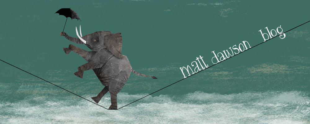
My header image, not where it should be...!

I spent till the wee small hours putting together an image for my blog header, but despite my best efforts I cannot get the blogger template layout to except my file. So that my work hasn't died in vain I'll post the header illustration and hope it will occupy it's rightfull place in due course...
Saturday 30 June 2007
Beware the dogs

hello all,
For my first posting here's an illustration I did as a door sign (there is a version with text which reads, "beware of the dogs...please ring the bell"). The short pooch is called Olli, the tall one is Shackleton (after the polar explorer) As you might be able to tell, their barks are far worse than their bites!
Subscribe to:
Posts (Atom)